




Most crypto investors don’t have a research problem. They have a filtering problem. On any given morning you can pull up fear and greed indices, check funding rates, scan on-chain data, read three contradictory macro takes on X, and still have absolutely no idea whether now is a good time to add to a position or sit on your hands. The data is everywhere. The clarity is nowhere.
That’s the exact problem the Diamond Pigs Crypto Sentiment Dashboard was built to fix. Behind the scenes, its AI analyzes dozens of market, on-chain, sentiment and macroeconomic signals every four hours to determine the overall market consensus. Rather than overwhelming users with data, the dashboard displays a carefully selected set of the indicators the AI considers most influential at that moment. The result is a free dashboard that helps investors quickly understand both current market conditions and the key drivers behind them. The same AI intelligence also forms the foundation for Diamond Pigs’ next generation of AI-powered investment bots.
Diamond Pigs is an Amsterdam-based crypto investing platform focused on calm, long-term strategies. The Sentiment Dashboard is its free public intelligence tool, and it’s genuinely useful on its own, even if you never sign up for one of the platform’s investment strategies. Think of it as the market briefing you wish someone handed you every morning.
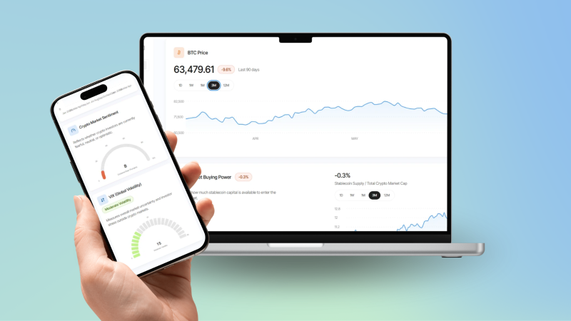
Diamond Pigs Crypto Sentiment Dashboard shown on mobile and desktop, displaying BTC price chart and Stablecoin Buying Power.
What the Diamond Pigs Sentiment Dashboard Actually Tracks
The dashboard isn’t just a Fear & Greed meter with a fresh coat of paint. Behind the scenes, its AI evaluates dozens of market signals before generating a single market consensus. The dashboard then visualizes a selection of the indicators that contribute most to that assessment, making complex market intelligence easy to understand.
Daily Market Summary
Every update cycle includes a plain-language summary of current market conditions. It reads more like a quick briefing than a data dump, calling out which factors are actually driving price action. If the VIX is spiking or smart money is positioning against retail, the summary says so directly.
BTC Price Across Multiple Timeframes
Bitcoin’s price is shown across five windows: 1 day, 1 week, 1 month, 3 months, and 12 months. Short-term noise and longer-term trend sit side by side, so you’re not making a week-one panic decision based on a single red candle.
Stablecoin Buying Power
This module measures the ratio of stablecoin supply to Bitcoin’s total market cap. When that ratio climbs, there’s dry powder on the sidelines waiting to enter the market. When it contracts, capital is already deployed. It’s a useful proxy for potential demand.
BTC Netflow and Exchange Flows
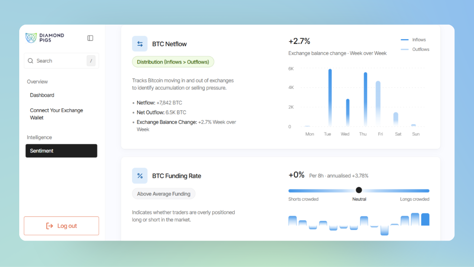
The netflow module tracks Bitcoin moving between exchanges and private wallets, displayed as a weekly bar chart of inflows versus outflows. Heavy inflows to exchanges typically signal potential selling pressure. Outflows suggest accumulation. It’s one of the cleaner on-chain signals available.
BTC Funding Rate and Open Interest
Funding rates show the cost of holding leveraged positions. The dashboard shows the current 8-hour rate, its annualised equivalent, and total open interest. When funding is elevated, the market is crowded with longs, and that’s worth knowing before you add exposure.
Macro Conditions: US Money Supply and VIX
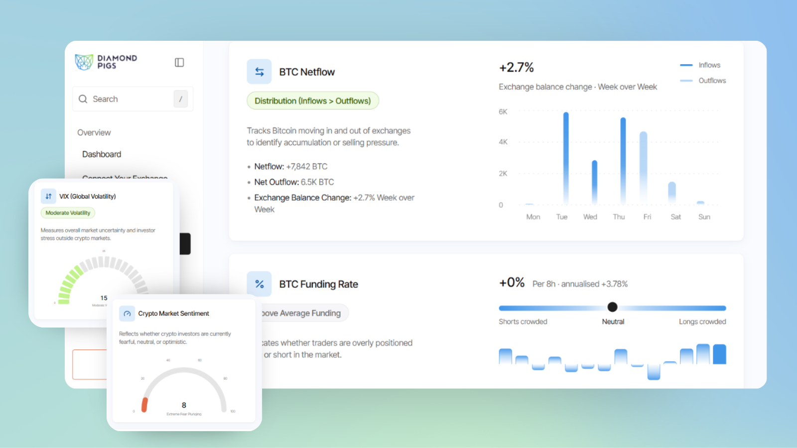
Crypto doesn’t exist in a vacuum. The dashboard tracks US money supply (M2 liquidity) and the VIX global volatility index. These macro signals add important context, especially during periods when traditional market stress bleeds directly into crypto pricing.
Marcus Checks the Dashboard at 7am Before Making a Move
Marcus, a freelance designer based in Rotterdam, has been holding Bitcoin and a small ETH position for about two years. He’s not a trader, but he watches the market closely enough that he used to spend 45 minutes every morning bouncing between CoinGlass, Glassnode, and a handful of crypto Twitter accounts just to feel like he had a read on things.
He started using the Diamond Pigs dashboard in early June. At 7:10am on a Tuesday, before opening his laptop for client work, he pulled up the dashboard on his phone. The daily summary flagged that funding rates were above average, the Fear and Greed index had dropped to extreme fear territory (a reading of 8 out of 100), and BTC netflow showed distribution pressure building on exchanges.
The dashboard’s overall signal for the week was Cautious. Marcus had been considering adding to his BTC position that morning after seeing a price dip overnight. The summary note specifically flagged that smart money was positioning against the broader crowd of buyers, and that no clear directional breakout had been confirmed.
He decided to wait. Three days later, BTC dropped another 6% before stabilising. Marcus later said the dashboard didn’t make the decision for him, but it gave him enough structured context to override the impulse to buy the dip on emotion alone. That’s exactly what it’s designed to do.
How the Dashboard Builds Its Market View
Step 1: Live Data Gets Pulled and Analysed
Every four hours, the system ingests fresh data across price, on-chain activity, derivatives markets, stablecoin supply, and macro indicators. Nothing is manually curated, it runs on a continuous cycle.
Step 2: Signals Are Weighted and Translated
The AI layer processes the incoming data and translates it into human-readable insights. Instead of presenting raw numbers, it generates concise explanations of what each signal means in context, and whether signals are aligning or conflicting.
Step 3: The Market Outlook Gets Updated
The final output is a clear market reading: Positive, Cautious, Neutral, or Negative. Alongside that label sits the full breakdown, so you can see exactly why the dashboard landed on that conclusion. You’re never just trusting a score blindly.
Who Should Be Using This
If you hold crypto and currently spend meaningful time hunting down market data from multiple sources, the Diamond Pigs dashboard saves you that time and gives you a more structured read in return. It works equally well for long-term holders who check in weekly and for more active investors who want a daily pulse check. It’s free, requires no account to browse, and the 4-hour refresh cycle means the data is rarely stale. Try it at diamondpigs.com and see what the market is actually telling you right now.